Motion blur
Sometimes, what’s needed is a new perspective.
We wanted to capture that feeling when you’re actually driving. The one that makes you take the long way home from work, that makes missing an exit a good thing.
To come at something from a new angle. To recontextualise it, and in doing so, express something that couldn’t be communicated previously.
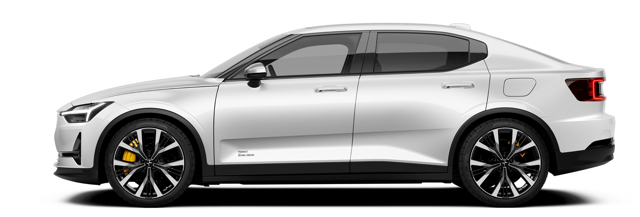
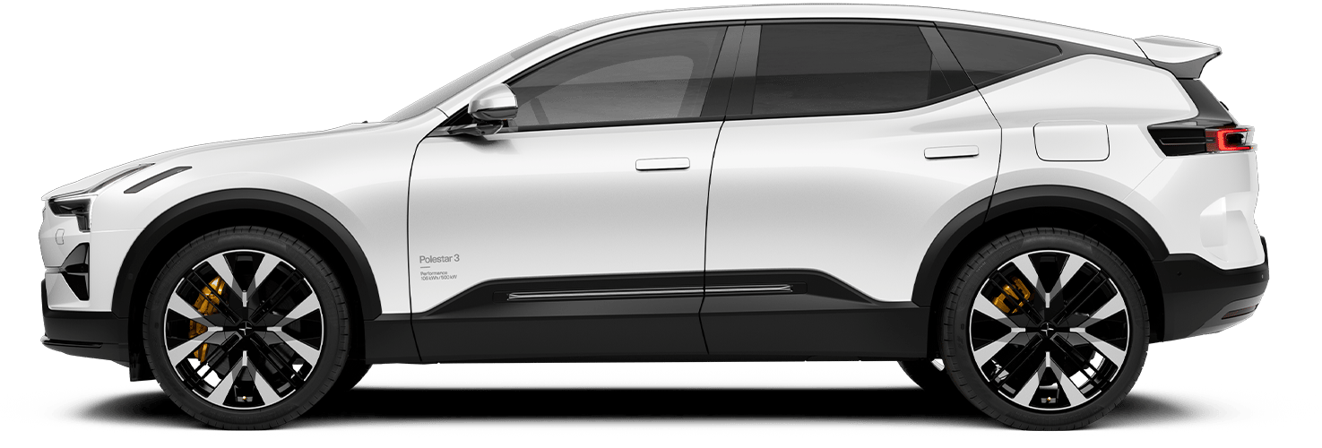
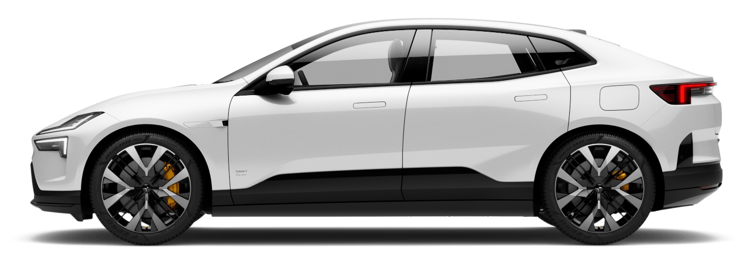
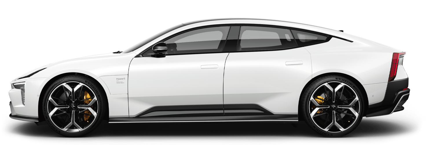
The product has always been the focus at Polestar. Since the dawn of the brand, the cars have taken centre stage. And rightly so. These cars don’t need extra ornamentation, or the trappings of an idealized lifestyle, or a fictional owner for would-be customers to project themselves onto.
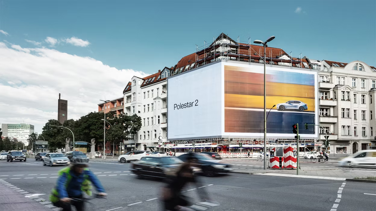
But this deep focus is only one way to see the product. Obviously, we want to zoom in on the details. We’re obsessed with them, after all. But there’s something to be said for zooming out. For showing the cars at a remove, in motion, with the environment reduced to shifting colours and blending hues. Capturing the joy of driving. Visually representing the fun of the experience behind the wheel.
“Of course it’s nice to get close to the product, appreciate the details,” says Head of Brand Pär Heyden. “But we also wanted to capture that feeling when you’re actually driving. The one that makes you take the long way home from work, that makes missing an exit a good thing.”
In other words, motion blur.
The apparent streaking of moving objects in images is nothing new to automotive. What is new is the extent to which we’ve embraced it. What once was a wall of shipping containers becomes a flowing background of lines and colours, an artistic representation of the unique feeling one gets with an accelerator at their feet and open road ahead.
And so, a new perspective. A new visual expression.


01/04
“Motion and colour are, in many ways, new for Polestar,” says Senior Creative Charlotte Starmark Sjösten. “This was an attempt to use both of those elements in an artistic, aesthetic way. Not necessarily sticking to the brand palette; daring to take things in a new direction.”
The background becomes a visual gradient, another element to emphasise the cars. Geographical location was never important to us anyway. These cars are at home in any environment, timeless and placeless. They look as good in front of the Sydney Opera House as they do in an abandoned quarry (no offense, Jørn Utzon).
The location for this particular production had to offer an array of colours. It had to be accessible. And the closer it was to Polestar Headquarters the better, to minimise the environmental impact. One location, four kilometres from the Cube, ticked all of these boxes.
Lundby Container Service.
A business that sells and rents shipping containers turned out to be the ideal backdrop for the visually ambitious project. It has all the trappings of a working port without the traffic. A crane, and the aforementioned containers, were all on hand over two sunny, frigid days in February 2022 when shooting took place.
“It was like playing with a colossal Lego set,” states This Is Made Photographer Oscar Hyltbring. “We could move containers when and where we needed to, shaping and tweaking the background in real life. All without having to shoot around dock traffic and incoming ships.” Shooting in slow motion, with the camera rig some distance from the car itself, helped to create the dreamlike atmosphere of the final product.
This approach was conceived of by the brand itself, free from outside influences. No bureau with a brief, no consultants with a mandate, no sprawl. Both the in-house team behind the concept, and the production itself, were comparatively small. But the results were enormous.
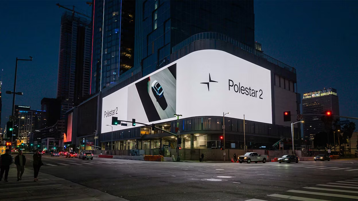
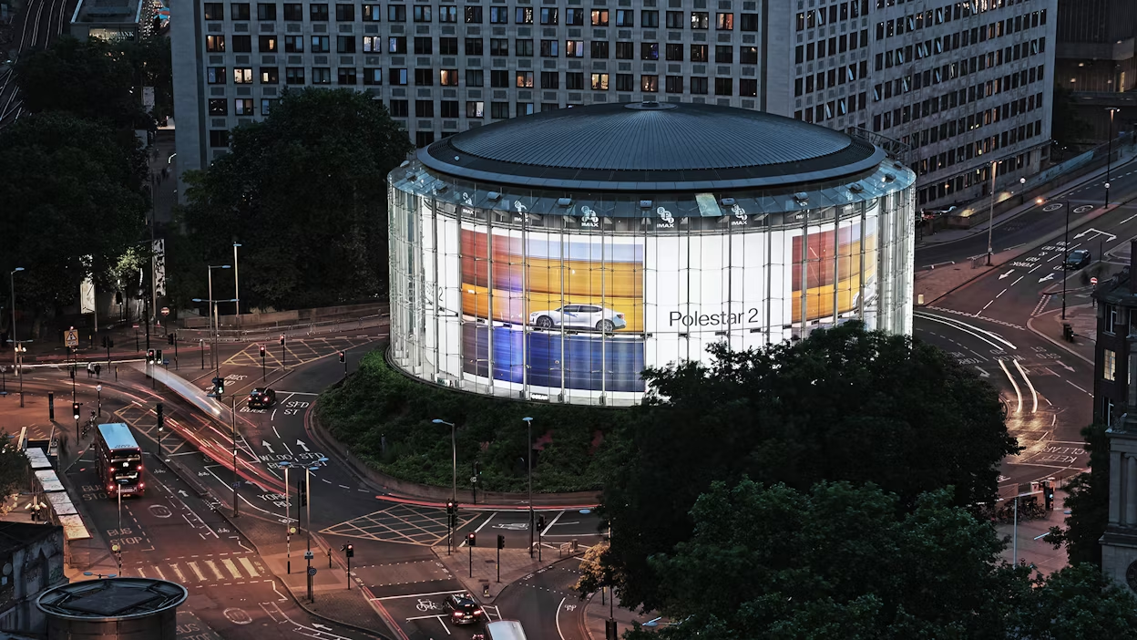
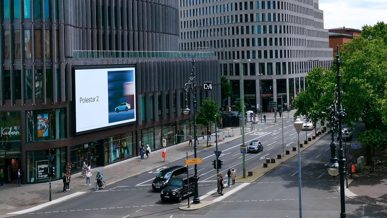
They’ve created a visual canvas which, like the products, finds itself at home in a variety of locations. From Los Angeles billboards to the pages of Vogue. From Berlin buildings to Esquire spreads. One that makes art out of communication, that does away with the static nature of so many product images in favour of portraying a feeling. A completely new perspective.
And always with the product in focus.
